- 100,000+ alerts opened from notifications in three years
- 85% of monthly users are returning users
- 1 in 6 people who used the app also opened a map, a layer SMS never had
This is the 3-minute version. The full case study (13 min) also covers login, the alert list, alert details and Geofence step by step.
The problem
SMS and email gave people little say over which alerts they got and from where, and SMS was costly for INSO
An alert by SMS or email already said what happened, where and what to do. What people couldn't do was shape what reached them.
Only whole regions. Each NGO has one or two people managing its INSO account in the Partners Portal, on a laptop, who activate regions for teams. Nothing finer than a region existed: no area around you, no route, no single compound.
Costly, and easy to miss. SMS was also costly, and alerts got lost among every other SMS and email.
Composing and sending meant a laptop. INSO staff needed a laptop to compose and send alerts.
The app is an alternative to SMS and email, which are still the only way in some regions. It brings both sides into one place: composing and sending alerts, and seeing how they appear in the feed.
Before
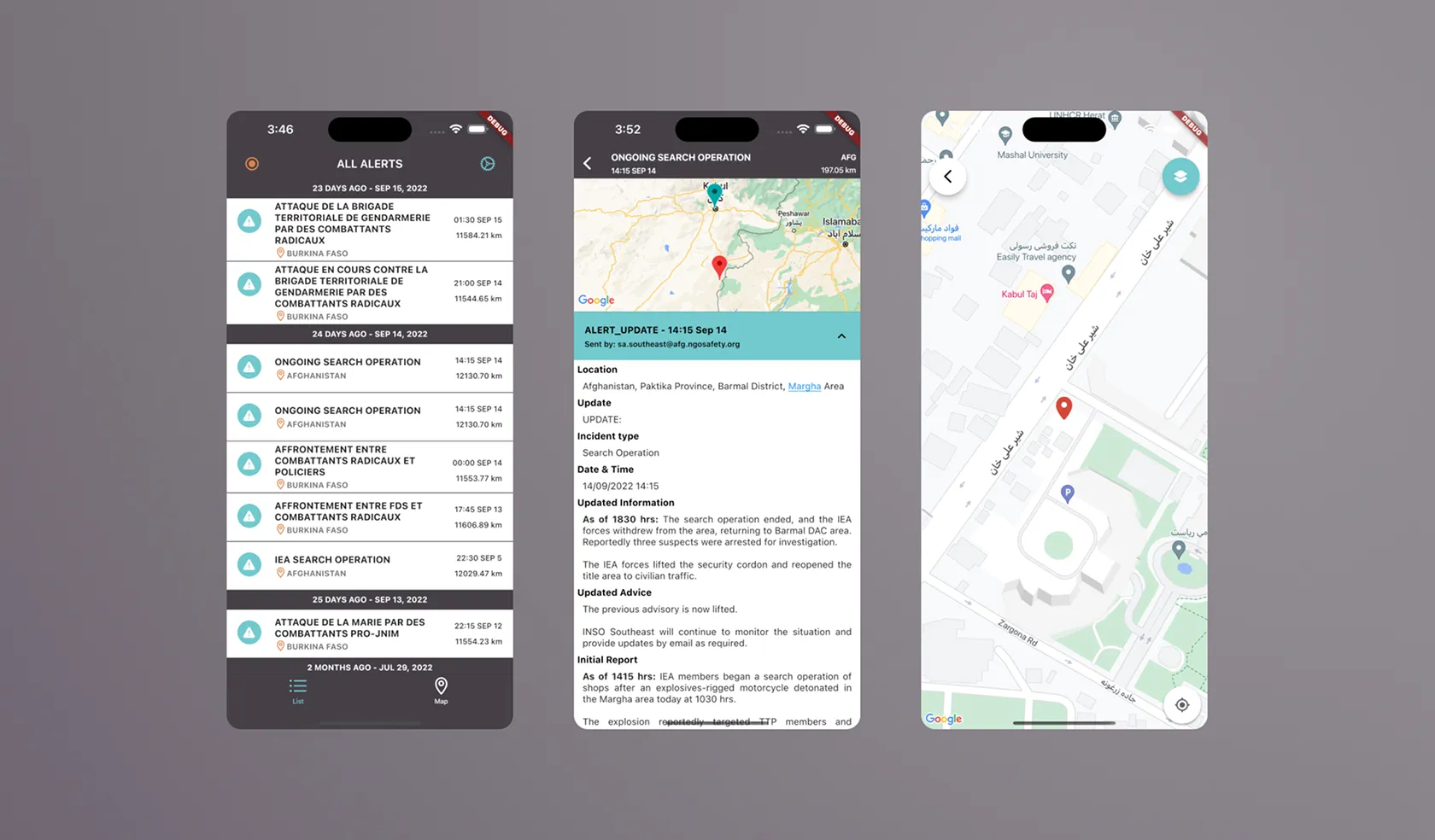
The first version was an engineers' initiative, built from conversations with country offices and nothing documented. I joined as the only designer, with no access to partners, so country office colleagues stood in for them. I combined a heuristic evaluation with interviews and Maze tests, and checked with partners after launch.
Users
Three groups, one sending and two receiving
Receive – user groups
| Who | Needs | Pains before the app |
|---|---|---|
 NGO field workersIn the field, on the move, exposed to risk, sometimes with no internet | Stay updated while movingFocus only on what affects their safety: the road, where they're going, where they sleep | Only whole regions, activated by their NGO's account admin on a laptopAlerts lost among every other SMS and email |
 Security and operations staffIn an office, keeping an eye on teams who travel, advising them by SMS or a call | Monitor specific areas remotelyTrack patterns and ongoing situations | Couldn't follow a place they weren't inNo radius or custom area, like the compound where staff live |
SharedBoth groups | Quickly understand what's happening nearbyTrust the accuracy of alertsStay updated in real time | High pressure, little time to readUnclear alerts reduce trustPhone checks are a security risk |
Send – user group
| Who | Needs | Pains before the app |
|---|---|---|
 INSO staff in the country officesCollect, validate, compose and send the alerts | Compose and send quickly, from anywhere, with or without dataReduce the cost of SMS | Composing and sending meant a laptop and the Partners Portal, hard from the fieldSMS was costly |
Maps
A map adds the where, for people who need it
Most people never open the map. By default the app does what SMS and email did: it sends you the alerts from the regions you subscribed to, and that is the main use. On top of that it adds a map layer and more control, like choosing the areas you want alerts from and the map mode that fits what you're doing. The map is for people who need to see where an alert comes from, follow one area, or explore during a mission, and who would otherwise need another map tool. About 1 in 6 people who used the app have opened a map.
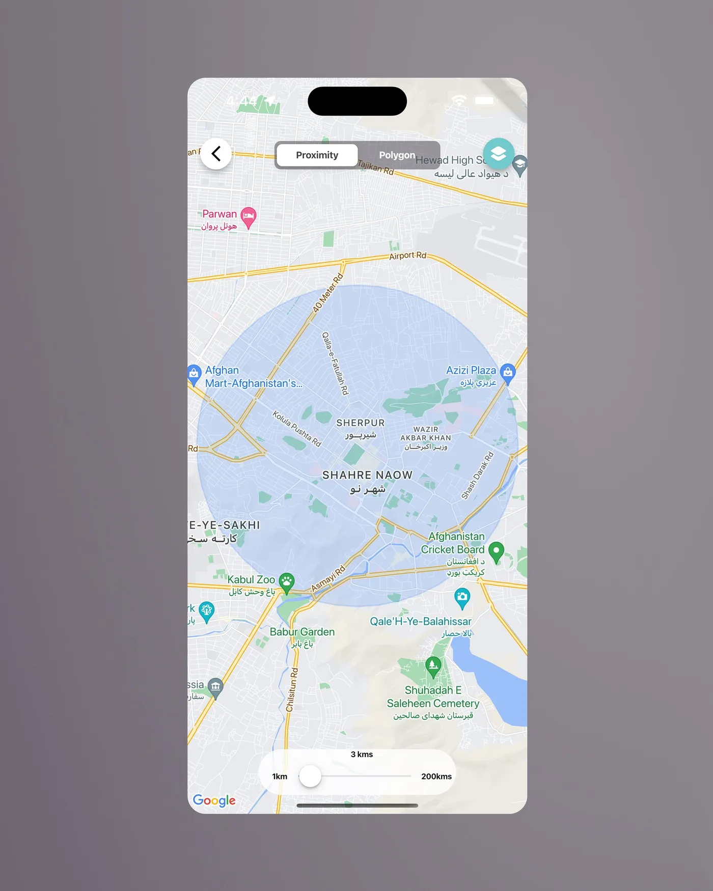
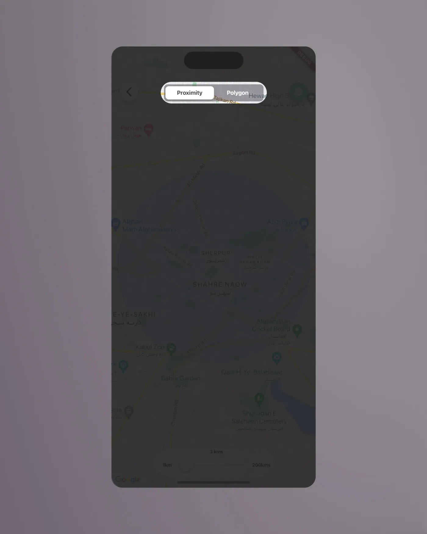
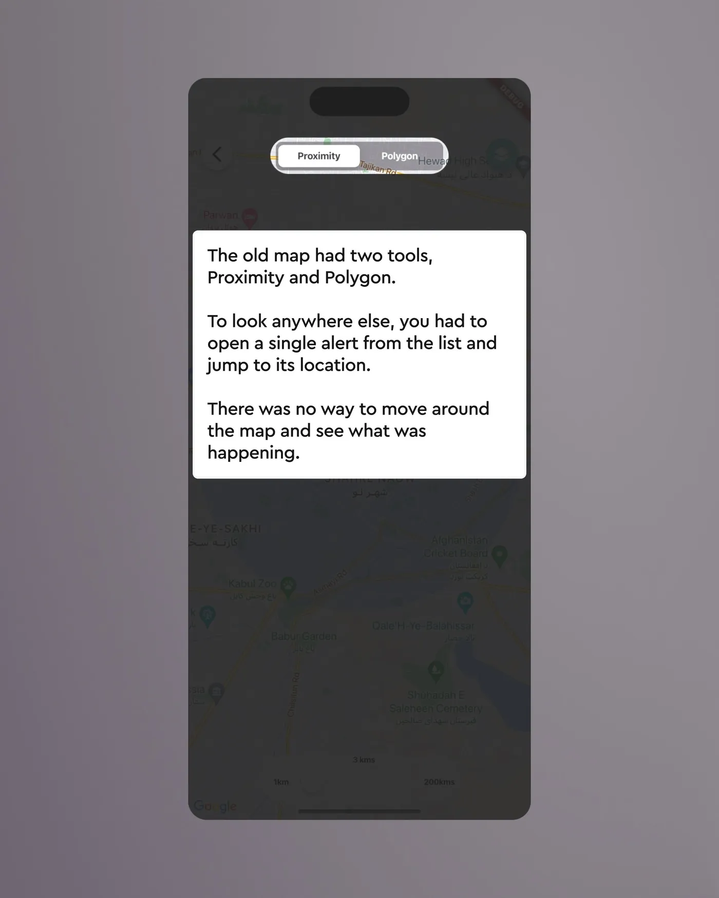
The old map had two tools, Proximity and Polygon. To look anywhere else, you had to open a single alert from the list and jump to its location. A heuristic evaluation turned up three gaps:
- You couldn't explore freely: the map only opened as a tool for setting a radius or drawing an area.
- You couldn't select an alert on the map and read it there.
- You couldn't move around the map, then switch back to the list to see only the alerts from that place.
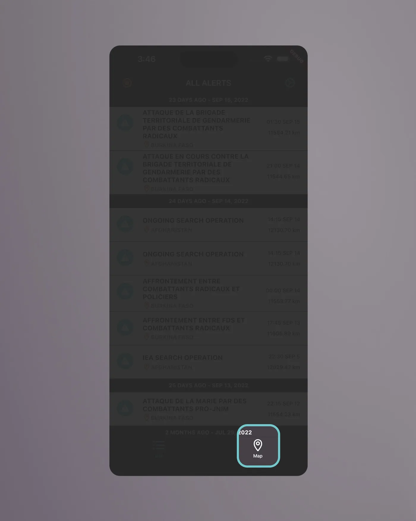
Explore: what's happening along my route?
Explore fixes all three. You can move around the map freely, tap an alert to read it there, and go to any place and switch back to the list to load the alerts from that area. The idea came from colleagues in the country offices, who raised it when we tested.
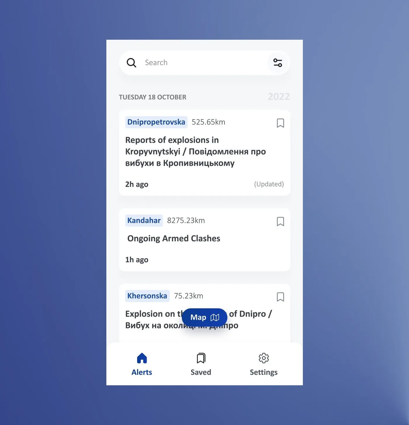
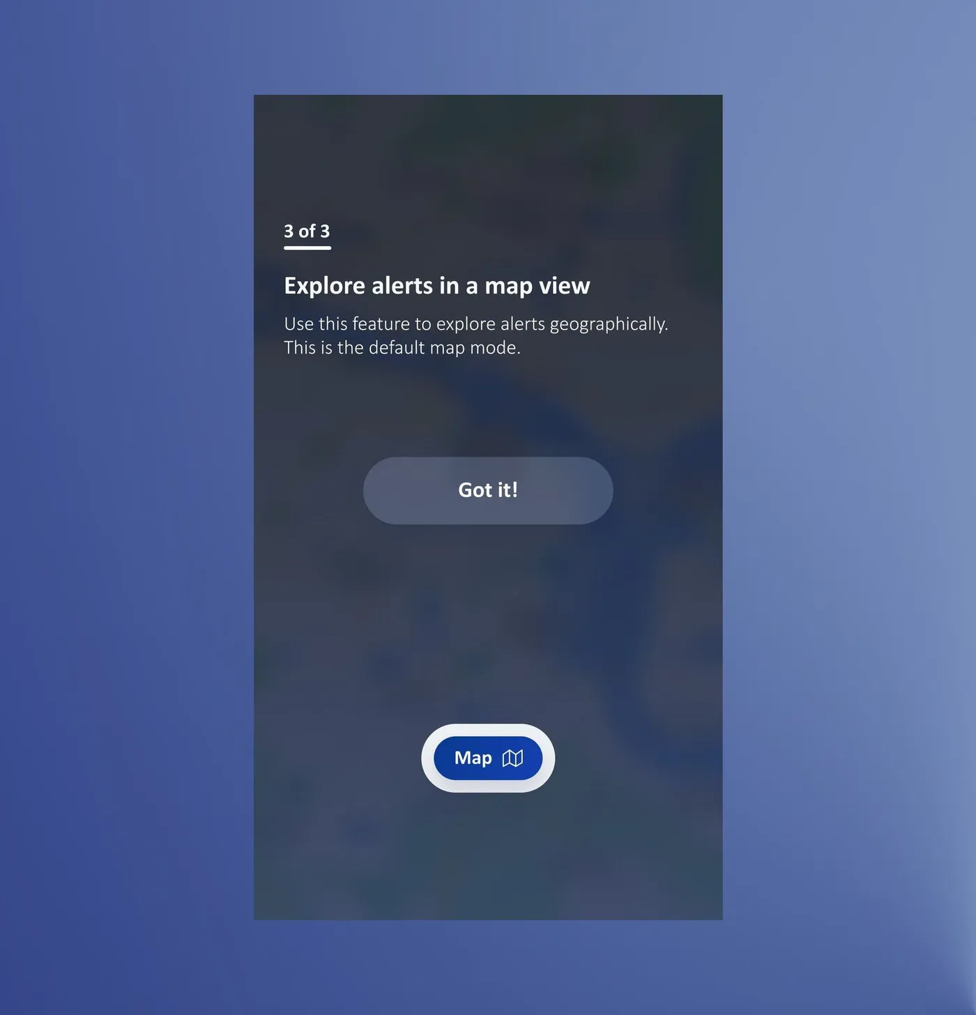
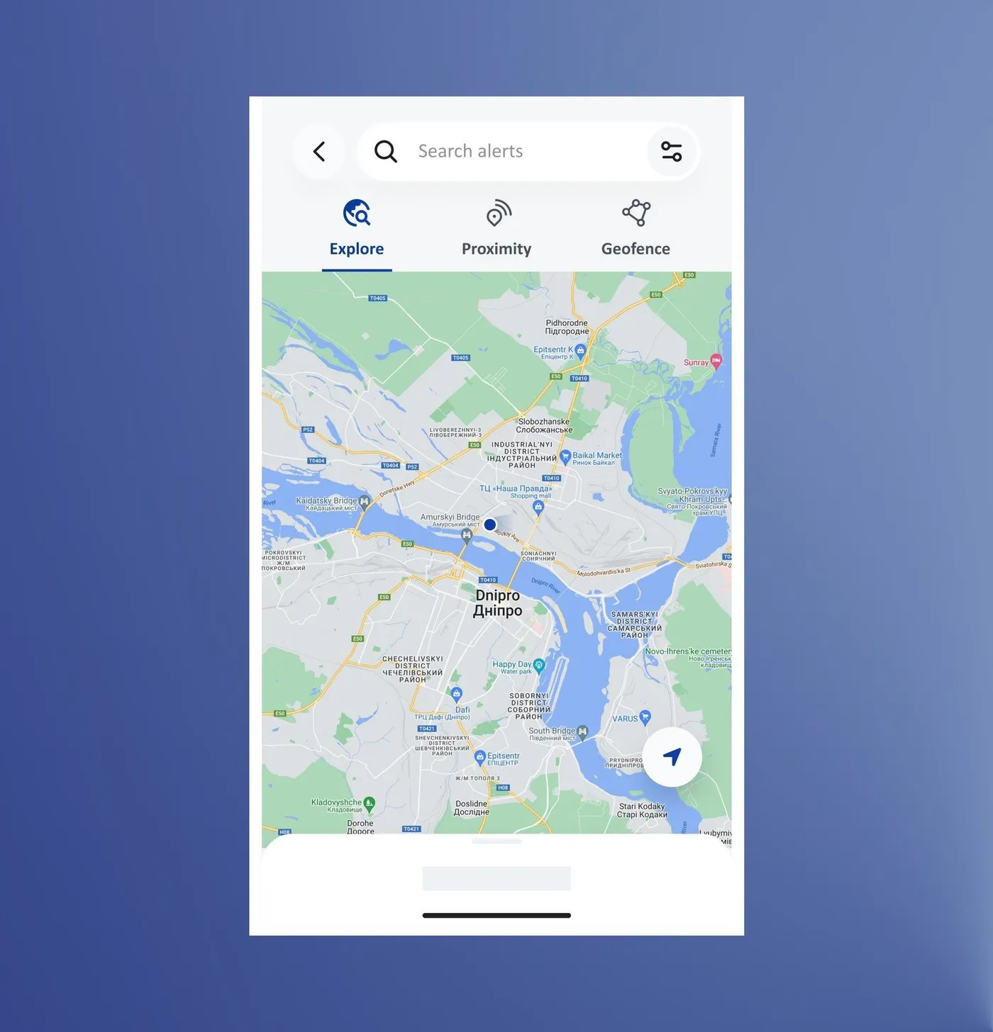
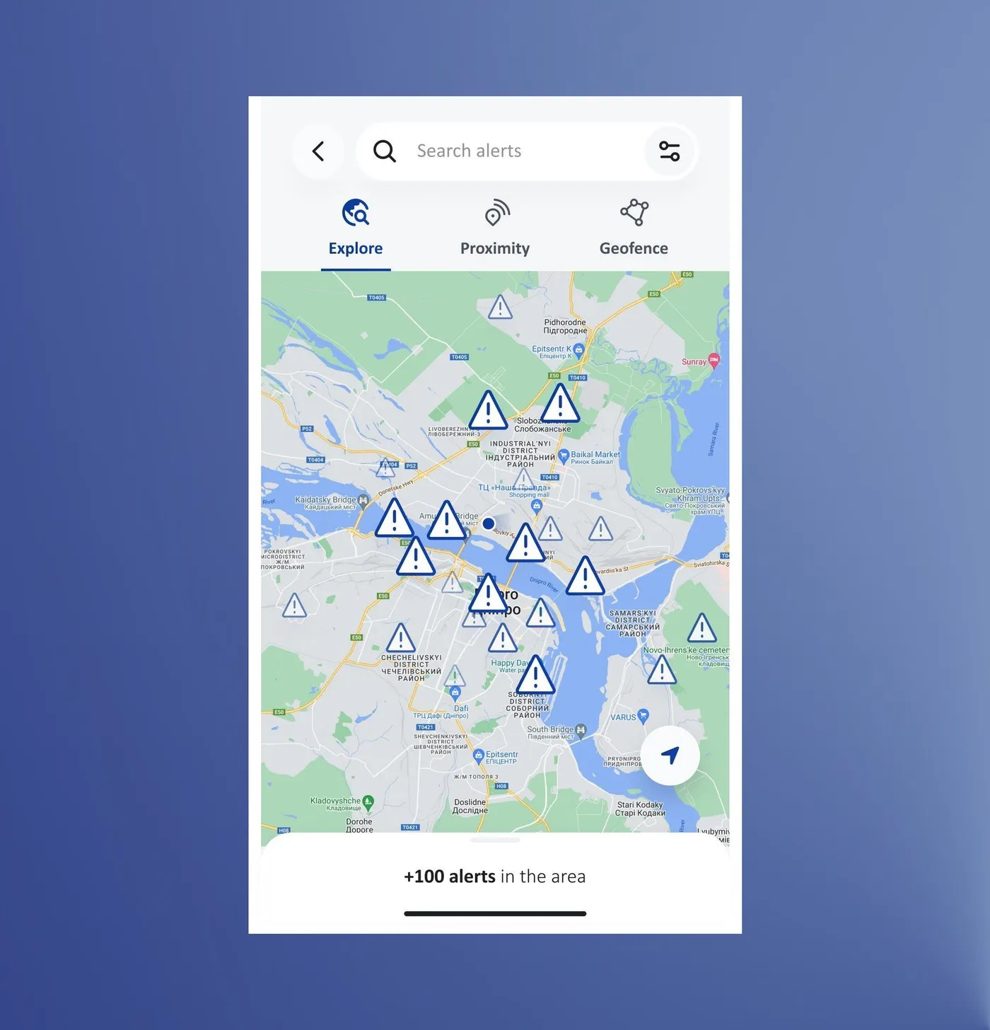
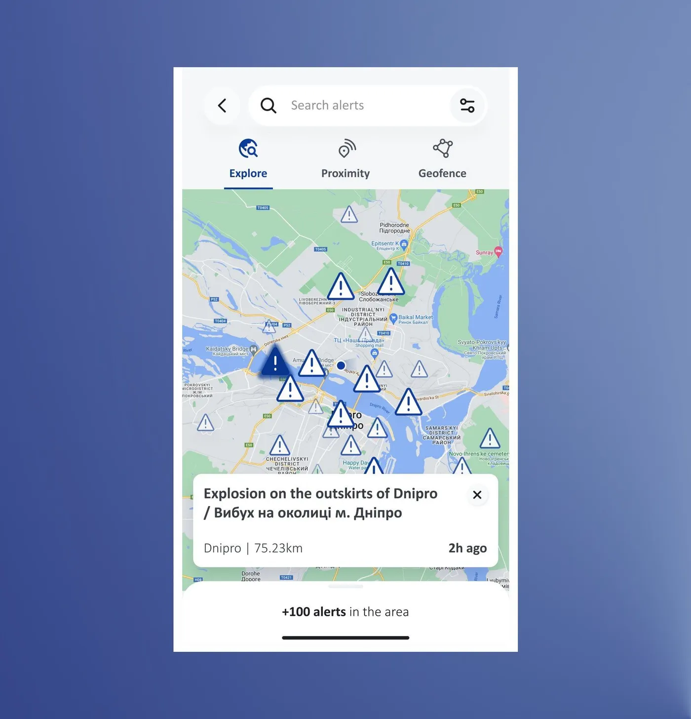
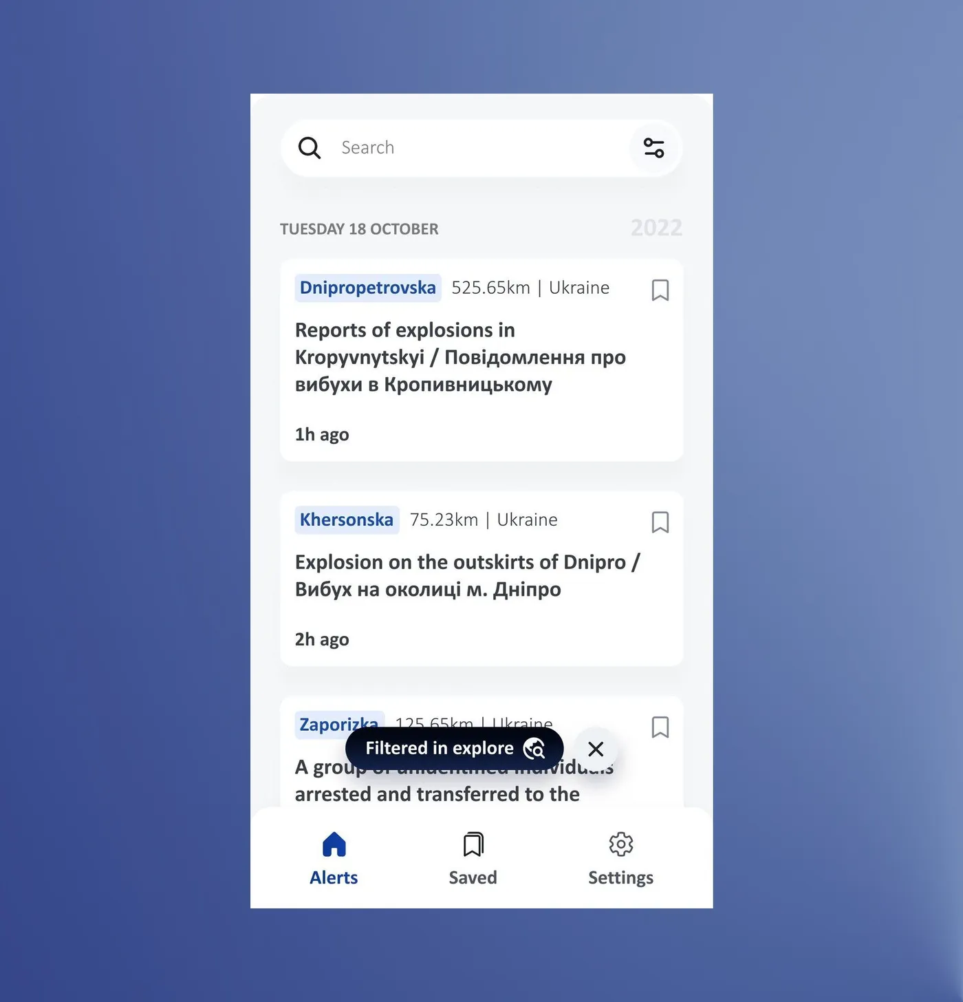
Testers found the map from the alerts list and explored it freely, with no drop-offs.
8 of 8 completed · 33 s on average · ease 8.6/10 · Maze test with country office colleagues
Proximity: understanding it isn't the same as using it
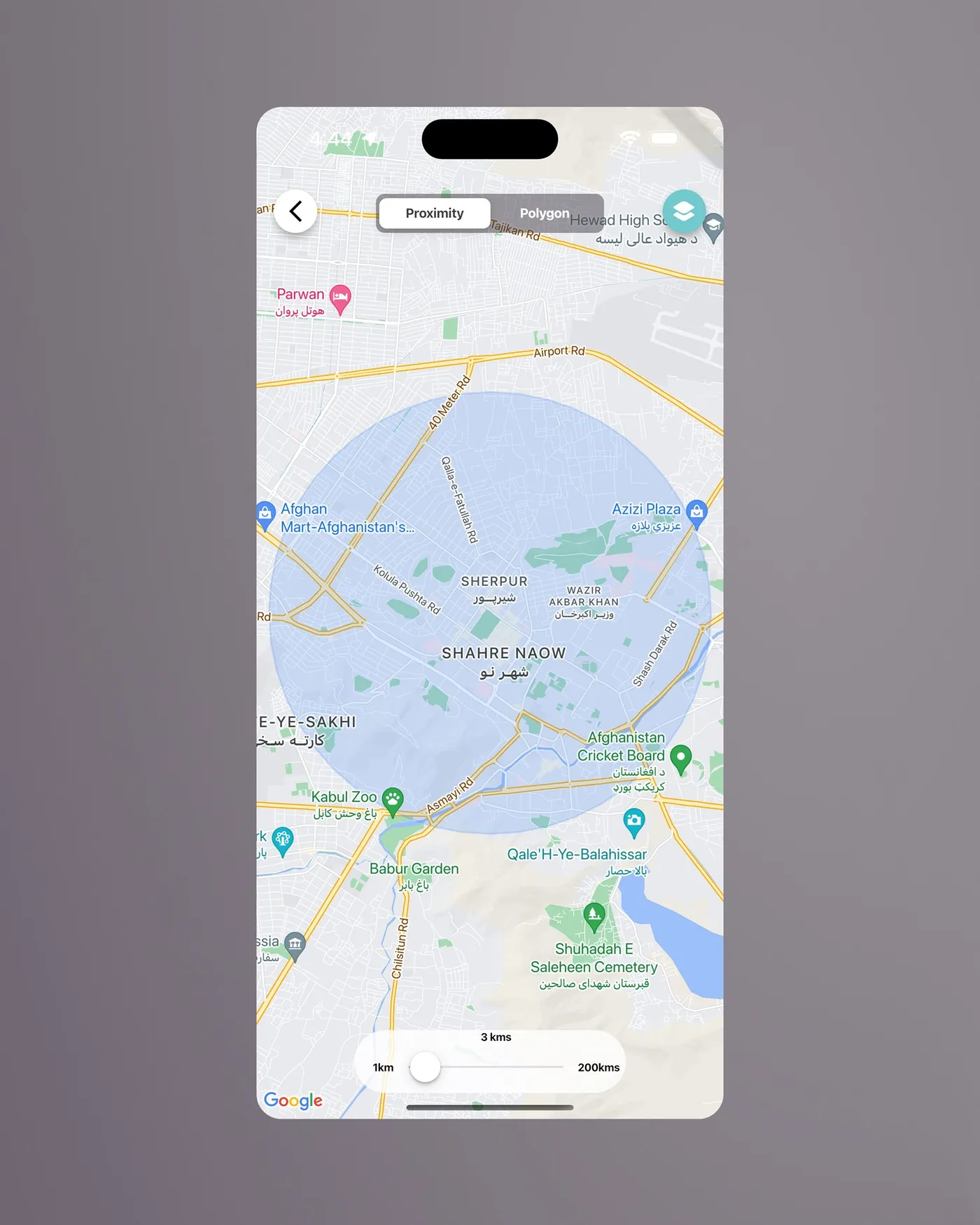
Proximity shows alerts within a radius of your live location, or of a pin you drop somewhere else. In the first version, one pop-up explained it.
Testers set a radius around a place they weren't in, but it was slow, and some couldn't tell live location from custom location.
6 participants · 53 s on average · ease 6.8/10 · Maze test with country office colleagues
While they were thinking aloud, most of them read the pop-up and explained the mode back to me correctly. But it's one thing to understand something and another to know how to put it into practice. So the pop-up became a short three-step tutorial: nothing too long, to avoid killing engagement, but enough to show how to use the mode.
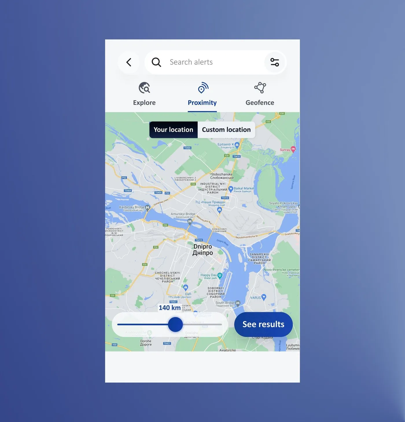
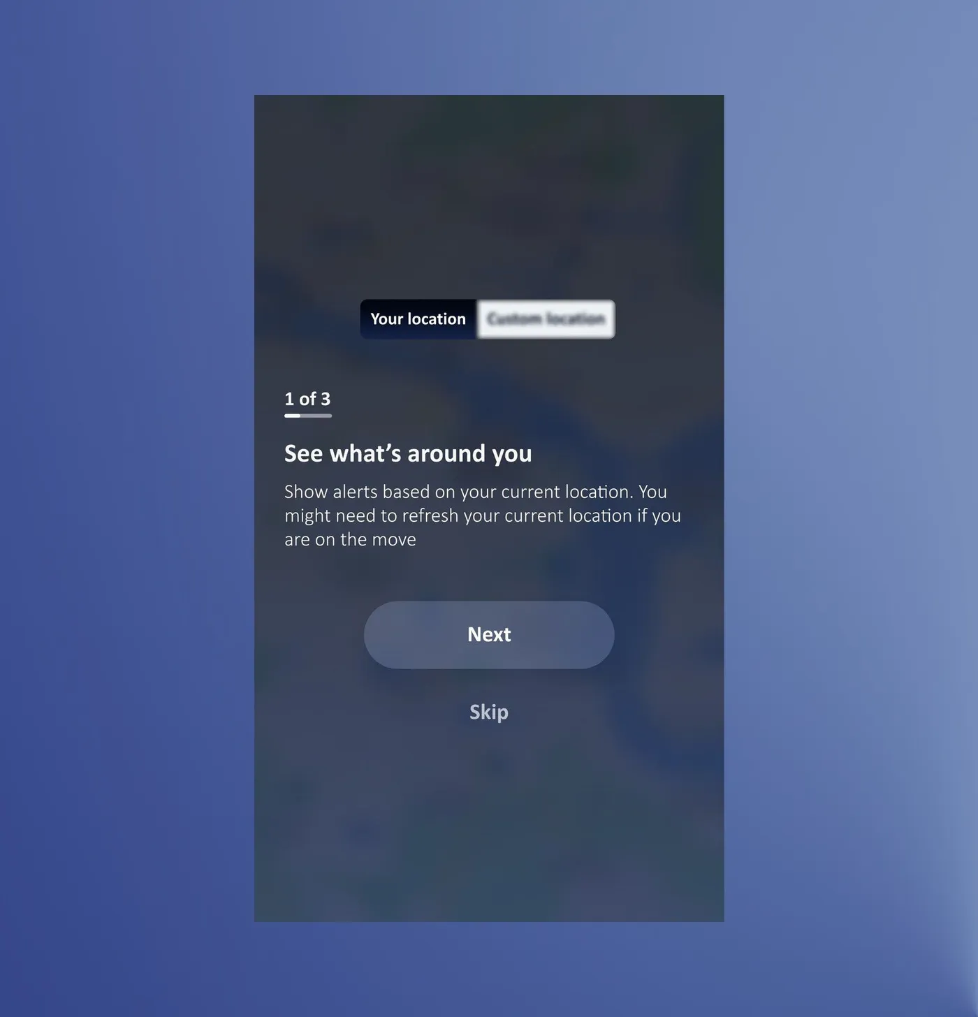
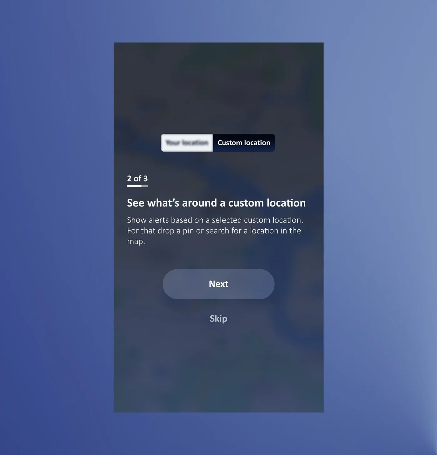
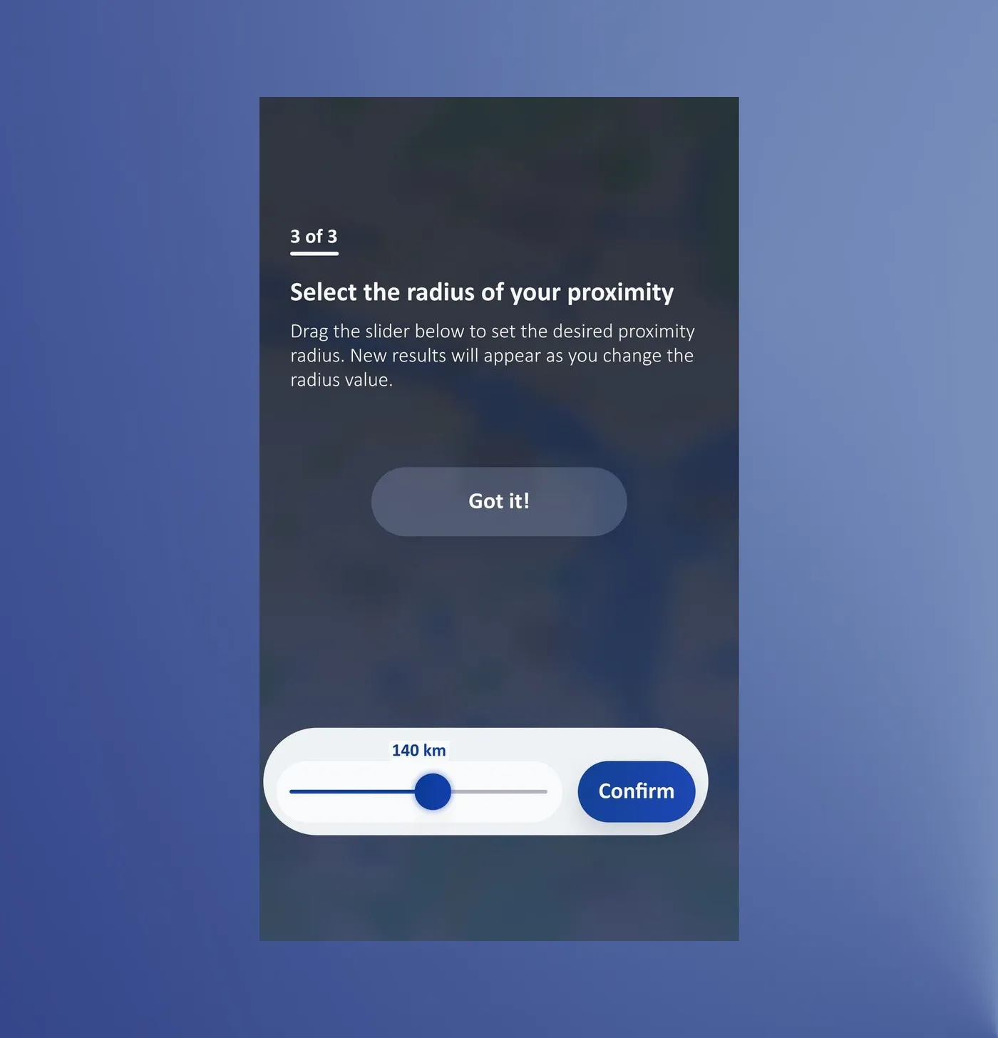
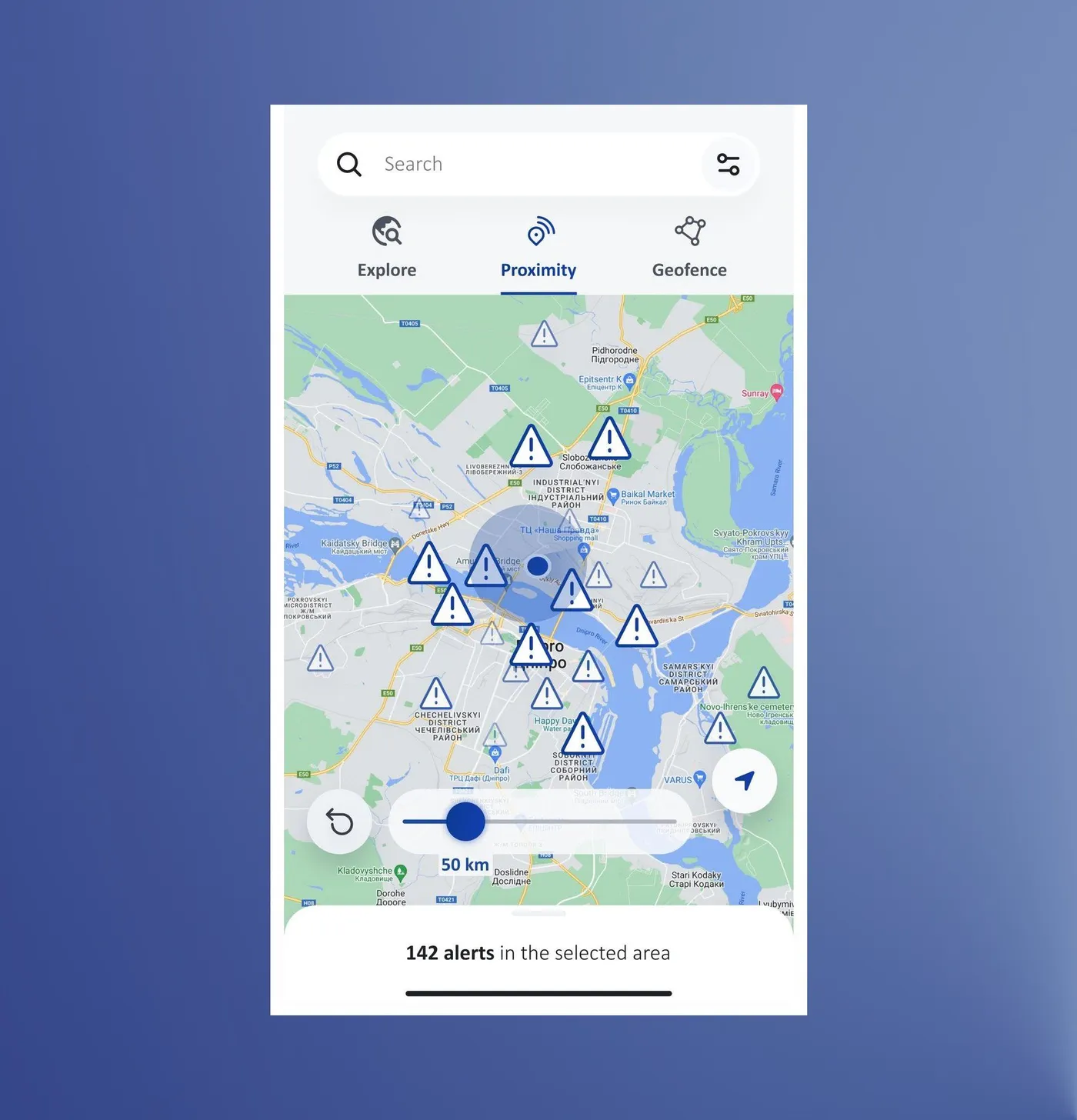
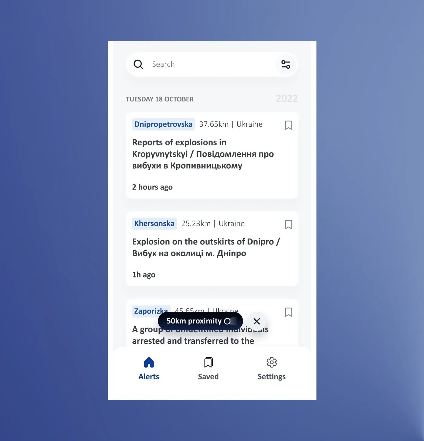
The tutorial cleared up the difference between live and custom location, and colleagues were more satisfied with the feature.
Interviews with 5 country office colleagues who hadn't seen the app before · updated design and prototype
Across releases, Explore takes most of the map traffic, with Proximity and Geofence well behind. That matches what partners ranked as most important.
Also in this app
Login, the alert list, alert details and Geofence
- Login. The app asked for location before anyone had logged in and never said what it was for. Two short onboarding screens now come first, and location is asked after.
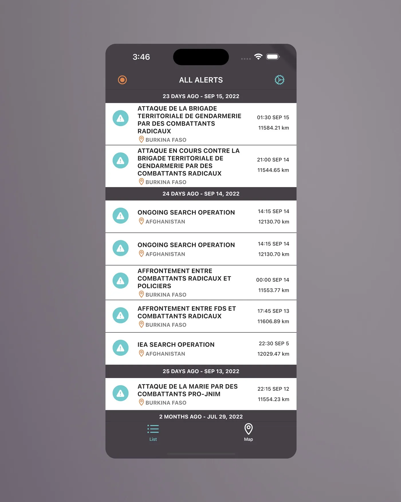
- Alert list. Eight dense alerts per screen became a list built for scanning: location first, then a short title, then time, with search at the top. 10 of 10 testers filtered alerts by location in 22 seconds on average (ease 9.3/10).
- Saved alerts. Not in the first draft. We asked country office colleagues how people could keep track of the alerts they care about when everything mixes together, and landed on pinning them to a Saved page in the bottom menu.
- Alert detail. A summary first (what, where, when, how far), then the latest update and advice, in the order the interviews showed.
- Geofence. Saving meant pressing Back. It now has a Confirm button, a three-step tutorial, and a name that says what it does.
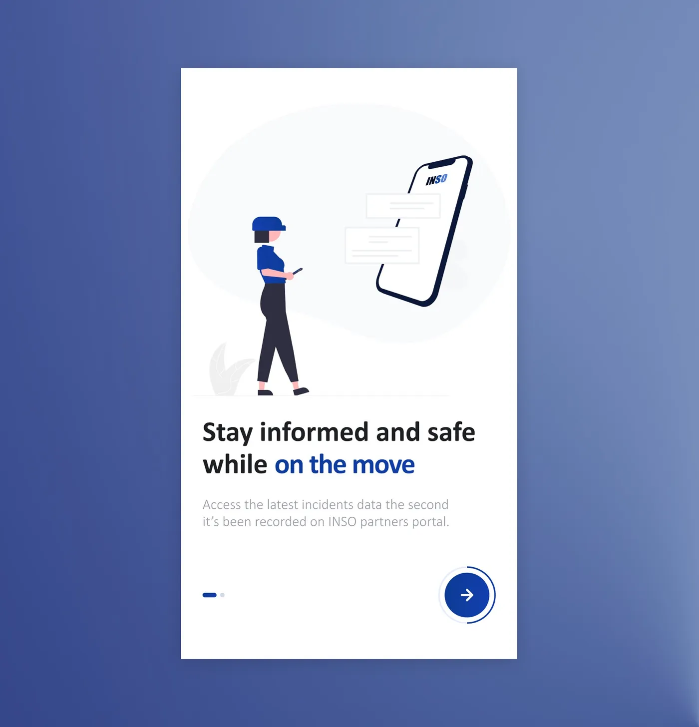
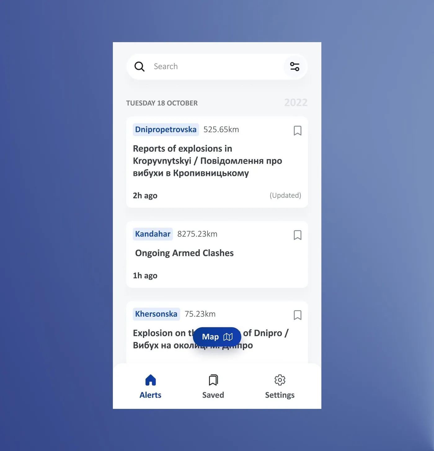
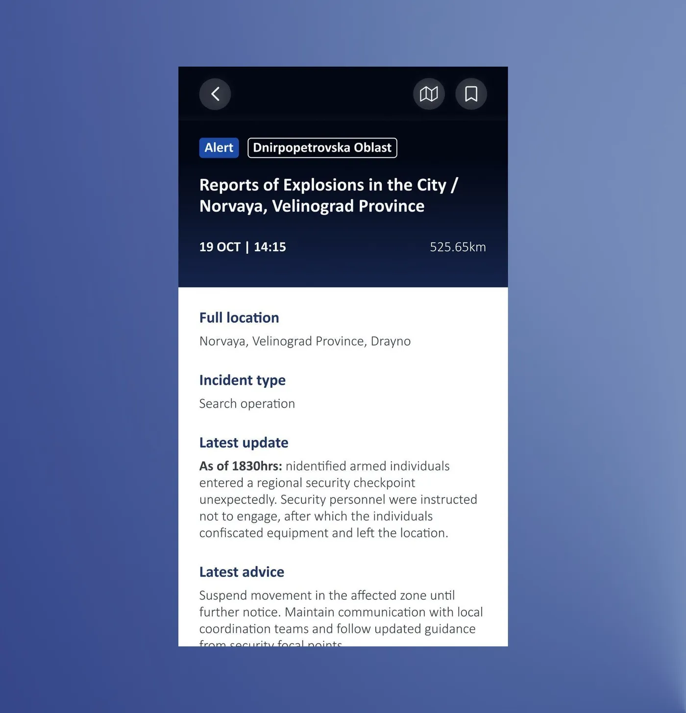
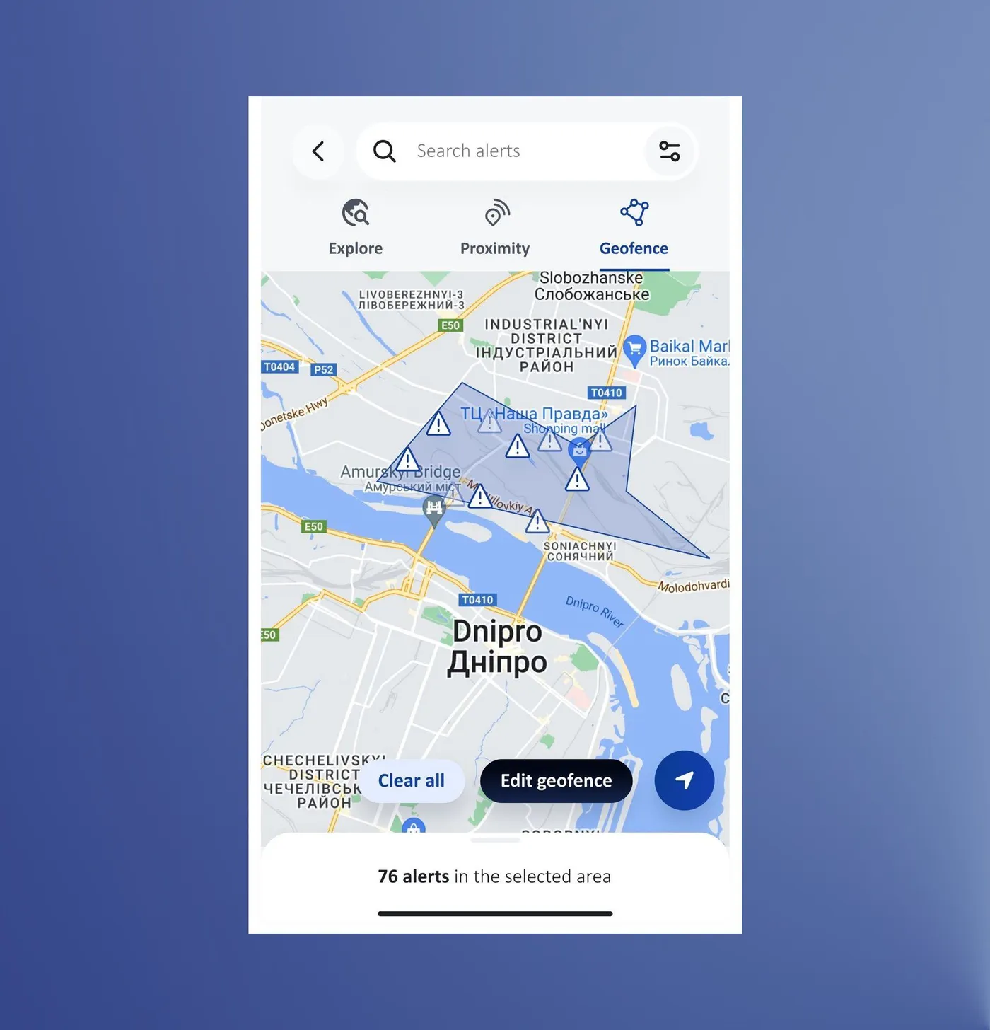
Want the detail behind login, the alert list, alert details and Geofence? Read the full case study (13 min).
Outcome
Used, and people keep coming back
After the launch peak of about 1,600 users, a steady base settled in: around 800 a month through 2024, and 450 to 630 through 2026. About 8 in 10 of them are returning users, and alerts have been opened from notifications over 100,000 times in three years.
Table view
| Month | Active users | Returning users |
|---|---|---|
| Jun 2023 | 1,630 | 1,160 |
| Jul 2023 | 1,270 | 1,080 |
| Aug 2023 | 1,000 | 900 |
| Sept 2023 | 890 | 800 |
| Oct 2023 | 870 | 780 |
| Nov 2023 | 830 | 770 |
| Dec 2023 | 900 | 760 |
| Jan 2024 | 860 | 740 |
| Feb 2024 | 820 | 730 |
| Mar 2024 | 780 | 700 |
| Apr 2024 | 800 | 700 |
| May 2024 | 790 | 670 |
| Jun 2024 | 810 | 690 |
| Jul 2024 | 760 | 660 |
| Aug 2024 | 720 | 620 |
| Sept 2024 | 840 | 680 |
| Oct 2024 | 740 | 630 |
| Nov 2024 | 740 | 630 |
| Dec 2024 | 740 | 650 |
| Jan 2025 | 730 | 640 |
| Feb 2025 | 690 | 600 |
| Mar 2025 | 710 | 630 |
| Apr 2025 | 700 | 620 |
| May 2025 | 680 | 580 |
| Jun 2025 | 660 | 580 |
| Jul 2025 | 740 | 630 |
| Aug 2025 | 690 | 590 |
| Sept 2025 | 650 | 530 |
| Oct 2025 | 640 | 530 |
| Nov 2025 | 530 | 470 |
| Dec 2025 | 500 | 420 |
| Jan 2026 | 480 | 400 |
| Feb 2026 | 480 | 410 |
| Mar 2026 | 530 | 440 |
| Apr 2026 | 500 | 420 |
| May 2026 | 460 | 400 |
| Jun 2026 | 460 | 380 |
| Jul 2026 | 460 | 370 |
| Aug 2026 | 450 | 380 |
| Sept 2026 | 630 | 450 |
Most partners found the app easy to use.
23 of 29 rated ease of use 4 or 5 (average 4.1/5) · post-launch survey of 31 partners
What I can't say. Nothing was measured before the new design, so I can't say whether it made the app better, only that it's used and that people keep coming back.
Take a look at app.ngosafety.org (opens in a new tab)
Takeaway
Test whether people can do it, not whether they understand it
Proximity taught me the most: testers explained the mode back to me correctly and still struggled to use it. Next time I'd also set baseline metrics before designing, so the outcome can be compared, not just observed.